

HOME
BASEBALL
OTHER
FEEDBACK
RULES
RANKINGS
HISTORY
TEAMS
Teams with asterisks are not yet posted
Abbotsford Canucks
Adirondack Thunder
Allen Americans
Atlanta Gladiators
Bakersfield Condors
Belleville Senators
Birmingham Bulls
Bloomington Bison
Bridgeport Islanders
Calgary Wranglers
Charlotte Checkers
Chicago Wolves
Cincinnati Cyclones
Cleveland Monsters
Coachella Valley Firebirds
Colorado Eagles
Evansville Thunderbolts
Fayetteville Marksmen
Florida Everblades
Fort Wayne Komets
Grand Rapids Griffins
Greensboro Gargoyles
Greenville Swamp Rabbits
Hartford Wolf Pack
Henderson Silver Knights
Hershey Bears
Huntsville Havoc
Idaho Steelheads
Indy Fuel
Iowa Heartlanders
Iowa Wild
Jacksonville Icemen
Kalamazoo Wings
Kansas City Mavericks
Knoxville Ice Bears
Lehigh Valley Phantoms
Lions de Trois-Rivières
Macon Mayhem
Maine Mariners
Manitoba Moose
Milwaukee Admirals
Newfoundland Growlers
Norfolk Admirals
Ontario Reign
Orlando Solar Bears
Pensacola Ice Flyers
Peoria Rivermen
Providence Bruins
Quad City Storm
Rapid City Rush
Reading Royals
Roanoke Rail Yard Dawgs
Rochester Americans
Rocket de Laval
Rockford IceHogs
San Diego Gulls
San Jose Barracuda
Savannah Ghost Pirates
South Carolina Stingrays
Springfield Thunderbirds
Syracuse Crunch
Tahoe Knight Monsters
Texas Stars
Toledo Walleye
Toronto Marlies
Tucson Roadrunners
Tulsa Oilers
Utah Grizzlies
Utica Comets
Wheeling Nailers
Wichita Thunder
Wilkes-Barre/Scranton Penguins
Worcester Railers

| Bakerfield Condors | 4 |
Notice: All logos on this page are included within the parameters of 17 U.S.C. § 107, which states that the reproduction of a copyrighted work for purposes of criticism and/or comment is not an infringement of copyright. No challenge to the copyrights of these logos is intended by their inclusion here.
Posted 2015 December 17
The Bakersfield Condors are making their AHL debut this year. This is the third league they have played in. They started in the West Coast Hockey League in 1995, and played in that league until it was absorbed by the East Coast Hockey League (which promptly renamed itself simply the "ECHL" to avoid the absurdity of the East Coast Hockey League having teams in California and Alaska) in 2003. They then played in the ECHL until this past summer, when the "West Side Story" resulted in the Edmonton Oilers moving the Condors up to the AHL. (There was some shuffling of franchises involved, but most fans don't really care about that.)
 The team was originally known as the
Bakersfield Fog, and as you can see the Fog were a serious contender for
"worst logo ever". The main reason the Fog never held the highest
score here on the Bush League Factor is that they changed their name
before I actually started the BLF. It was in 1998 that the team
switched its name to the Bakersfield Condors.
The team was originally known as the
Bakersfield Fog, and as you can see the Fog were a serious contender for
"worst logo ever". The main reason the Fog never held the highest
score here on the Bush League Factor is that they changed their name
before I actually started the BLF. It was in 1998 that the team
switched its name to the Bakersfield Condors.
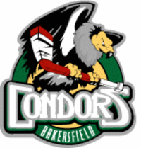
The original Condors logo was essentially the same as this one, only with a different color scheme and with a circle that said "Bakersfield" in the background. I have to say that I'm glad they got rid of the circle. It looked disturbingly like a target, and condors are an endangered species. I can't say I approve of the implications. On the other hand, I'm not a fan of the new color scheme. I understand why they went with it: they're matching their parent team's color scheme. But there's a problem with matching their parent team's color scheme, which is that their parent team's color scheme is ugly. I've never been a fan of orange and blue. For that matter, I've never been a fan of orange and any other color, or even orange by itself. But orange and blue is particularly bad.
 I'm not alone on this. An article I
found online shows that of the ten "basic" colors (black, blue, brown,
green, grey, orange, purple, red, white, and yellow), more people choose
orange as their least favorite than any other color. In fact, when you
combine orange with brown (and brown is just a dark shade of orange),
over half of all people choose it as their least favorite. Blue, on the
other hand, is the most popular color, with just under half of all
people choosing it as their favorite, and less than one percent choosing
it as their least favorite. And that's the problem here: the Oilers are
pairing many people's favorite color with their least favorite. Are you
familiar with Schopenhauer's Law of Entropy? It goes like this: Pour a
teaspoon of wine into a barrel of sewage and you have a barrel of
sewage. Pour a teaspoon of sewage into a barrel of wine and you have a
barrel of sewage. Color-wise, the Oilers are mixing wine with sewage.
It doesn't matter what the proportions are, the result is sewage. The
Oilers have a sewagy color scheme, and now so do the Condors.
I'm not alone on this. An article I
found online shows that of the ten "basic" colors (black, blue, brown,
green, grey, orange, purple, red, white, and yellow), more people choose
orange as their least favorite than any other color. In fact, when you
combine orange with brown (and brown is just a dark shade of orange),
over half of all people choose it as their least favorite. Blue, on the
other hand, is the most popular color, with just under half of all
people choosing it as their favorite, and less than one percent choosing
it as their least favorite. And that's the problem here: the Oilers are
pairing many people's favorite color with their least favorite. Are you
familiar with Schopenhauer's Law of Entropy? It goes like this: Pour a
teaspoon of wine into a barrel of sewage and you have a barrel of
sewage. Pour a teaspoon of sewage into a barrel of wine and you have a
barrel of sewage. Color-wise, the Oilers are mixing wine with sewage.
It doesn't matter what the proportions are, the result is sewage. The
Oilers have a sewagy color scheme, and now so do the Condors.
Aside from the color, though, I do like the logo. I could do without the hockey stick the condor is perched on, but the condor is certainly well drawn. It's drawn quite realistically, and the artist did a good job of making the condor look menacing without going overboard with it. When I look at the old logo, I think to myself, wow, that's a darned good logo.
Then I look at the new one, and I just sigh.
Seriously, guys, orange and blue just sucks. Fix it.
Final Score: 4 points.
Penalties: Name-Logo, 2 pts; Equip-Logo, 5 pts.
Bonuses: Local, -3 pts.