
HOME
BASEBALL
OTHER
FEEDBACK
RULES
RANKINGS
HISTORY
TEAMS
Teams with asterisks are not yet posted
Abbotsford Canucks
Adirondack Thunder
Allen Americans
Atlanta Gladiators
Bakersfield Condors
Belleville Senators
Birmingham Bulls
Bloomington Bison
Bridgeport Islanders
Calgary Wranglers
Charlotte Checkers
Chicago Wolves
Cincinnati Cyclones
Cleveland Monsters
Coachella Valley Firebirds
Colorado Eagles
Evansville Thunderbolts
Fayetteville Marksmen
Florida Everblades
Fort Wayne Komets
Grand Rapids Griffins
Greensboro Gargoyles
Greenville Swamp Rabbits
Hartford Wolf Pack
Henderson Silver Knights
Hershey Bears
Huntsville Havoc
Idaho Steelheads
Indy Fuel
Iowa Heartlanders
Iowa Wild
Jacksonville Icemen
Kalamazoo Wings
Kansas City Mavericks
Knoxville Ice Bears
Lehigh Valley Phantoms
Lions de Trois-Rivières
Macon Mayhem
Maine Mariners
Manitoba Moose
Milwaukee Admirals
Newfoundland Growlers
Norfolk Admirals
Ontario Reign
Orlando Solar Bears
Pensacola Ice Flyers
Peoria Rivermen
Providence Bruins
Quad City Storm
Rapid City Rush
Reading Royals
Roanoke Rail Yard Dawgs
Rochester Americans
Rocket de Laval
Rockford IceHogs
San Diego Gulls
San Jose Barracuda
Savannah Ghost Pirates
South Carolina Stingrays
Springfield Thunderbirds
Syracuse Crunch
Tahoe Knight Monsters
Texas Stars
Toledo Walleye
Toronto Marlies
Tucson Roadrunners
Tulsa Oilers
Utah Grizzlies
Utica Comets
Wheeling Nailers
Wichita Thunder
Wilkes-Barre/Scranton Penguins
Worcester Railers

| Milwaukee Admirals | 18 |
Notice: All logos on this page are included within the parameters of 17 U.S.C. § 107, which states that the reproduction of a copyrighted work for purposes of criticism and/or comment is not an infringement of copyright. No challenge to the copyrights of these logos is intended by their inclusion here.
Posted 2016 January 17
 Why, Milwaukee Admirals, why?
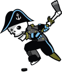
Your previous logo was the gold standard in So Bad It's Good logos. An utterly over-the-top, utterly ludicrous logo that featured a skeleton (with eyes) dressed up in a bizarre mixture of naval and hockey uniforms (note the admiral's hat, formal naval jacket, hockey pants, and hockey gloves), with a skate on one foot and a peg leg for his other foot, and with a hockey stick made of a twig lashed with a rope to a shinbone and the bones of a foot with hockey tape wrapped around said toes. It may not have been intimidating, but it was memorable. Oh, dear god, was it memorable! If I live to be a hundred and on my 100th birthday someone asks me what the most memorable hockey logo I've ever seen is, I'll probably say it was the logo the Milwaukee Admirals used from 2006 to 2014. (Well, either that or I'll say, "What? Speak up, I can't hear you!") But this new logo...what were you thinking?
I suspect that what you were thinking was "We're going to take the best things from the old logo and drop the worst things from it, and in the process come up with a really great logo." And that sounds great in theory, but there's a major problem with it, which is that there weren't any best things in the old logo. What made the old logo so wonderful was that everything about it was terrible. There wasn't a single thing about the old logo that was good. Everything about it was bad, and it was bad by design and without apology. The only way to come up with a good logo to replace the old one is to completely throw the old one out and start from scratch. And you didn't do that.
Truth be told, this logo wouldn't be too bad — might even be good — if you'd make two simple changes. First, the skull has got to go. Your team isn't called the "Skeletons", after all. Put some skin on that face. Second, if you feel the need to put something in the middle of the bicorn, don't put an "A" made out of bones. Put an "A" in a normal font, or some stars, or just leave it alone.
And while I'm criticizing anyway, I'd like to point out that when U.S. admirals wore bicorns the long side went front-to-back, not side-to-side. Also, that single star on the logo? A single star is the insignia of a commodore, not an admiral (admirals have between two and five stars). But I'll let those slide if you fix the other things.
And you really need to fix the other things. The old logo was laughable in the best possible way. This logo is still laughable, but not in a good way at all.
Final Score: 18 points.
Penalties: Irrelevance, 14 pts; Name-Logo, 2 pts; YuckyLogo, 5 pts.
Bonuses: Local, -3 pts.