

HOME
BASEBALL
OTHER
FEEDBACK
RULES
RANKINGS
HISTORY
TEAMS
Teams with asterisks are not yet posted
Abbotsford Canucks
Adirondack Thunder
Allen Americans
Atlanta Gladiators
Bakersfield Condors
Belleville Senators
Birmingham Bulls
Bloomington Bison
Bridgeport Islanders
Calgary Wranglers
Charlotte Checkers
Chicago Wolves
Cincinnati Cyclones
Cleveland Monsters
Coachella Valley Firebirds
Colorado Eagles
Evansville Thunderbolts
Fayetteville Marksmen
Florida Everblades
Fort Wayne Komets
Grand Rapids Griffins
Greensboro Gargoyles
Greenville Swamp Rabbits
Hartford Wolf Pack
Henderson Silver Knights
Hershey Bears
Huntsville Havoc
Idaho Steelheads
Indy Fuel
Iowa Heartlanders
Iowa Wild
Jacksonville Icemen
Kalamazoo Wings
Kansas City Mavericks
Knoxville Ice Bears
Lehigh Valley Phantoms
Lions de Trois-Rivières
Macon Mayhem
Maine Mariners
Manitoba Moose
Milwaukee Admirals
Newfoundland Growlers
Norfolk Admirals
Ontario Reign
Orlando Solar Bears
Pensacola Ice Flyers
Peoria Rivermen
Providence Bruins
Quad City Storm
Rapid City Rush
Reading Royals
Roanoke Rail Yard Dawgs
Rochester Americans
Rocket de Laval
Rockford IceHogs
San Diego Gulls
San Jose Barracuda
Savannah Ghost Pirates
South Carolina Stingrays
Springfield Thunderbirds
Syracuse Crunch
Tahoe Knight Monsters
Texas Stars
Toledo Walleye
Toronto Marlies
Tucson Roadrunners
Tulsa Oilers
Utah Grizzlies
Utica Comets
Wheeling Nailers
Wichita Thunder
Wilkes-Barre/Scranton Penguins
Worcester Railers
| Wheeling Nailers | 11 |
Notice: All logos on this page are included within the parameters of 17 U.S.C. § 107, which states that the reproduction of a copyrighted work for purposes of criticism and/or comment is not an infringement of copyright. No challenge to the copyrights of these logos is intended by their inclusion here.
Posted 2003 November 13
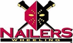
Rarely do I see a logo I like so much attached to a name I like so little.
There's really not much you can say to defend the name. At best, it conjures images of carpentry work. At work, it looks like someone left three letters out of "nailbiters". The explanation about Wheeling being the "Cut Nail Capital of the World" just makes the whole city look stupid -- this is nothing to brag about. And making a name out of it...look, guys, I live in Raleigh, which is known as the City of Oaks. How stupid would it sound if someone tried to call a team the Raleigh Oakers? The prosecution rests.
But I do love that logo. The red and black is probably the boldest color scheme you can use. The way the mask is red on one side and black on the other, along with the geometric pattern of yellow dots, makes the whole thing look like the facepaint of a tribal warrior. The placement of the eye holes under the aforementioned yellow dots creates a fierce look. And the way the nails are positioned look like they're going through someone's head. You can't see the face behind this mask, but whoever it belongs to, that person is hardcore. This is the closest any logo I've ever seen comes to actually unsettling me. This is the polar opposite of all those damn cartoon characters, and I love it.
The symmetry also works in its favor. A lot of times excessive symmetry makes a logo boring, but given the simplicity of the theme it strengthens it here. In fact, the only real criticism I can come up with here is that it says "Nailers Wheeling" instead of "Wheeling Nailers". But given the design elements involved, I'm even prepared to forgive that.
I also love the fact that they resisted the temptation to replace one of those nails with a hockey stick. A lot of people wouldn't have been able to help themselves.
I debated for some time whether to give them any points for hockey equipment. The mask in the logo isn't technically a goaltender's mask (I believe it's supposed to be the mask that nailmakers wear), but the allusion is obvious. In the end I decided to give them a half-penalty for this one.
Final Score: 11 points.
Penalties: -Ers, 9 pts; Name-Logo, 2 pts; Equip-Logo (half penalty), 3 pts;
Yucky-Name, 5 pts
Bonuses: Cool-Name, -5 pts; Local, -3 pts