

HOME
BASEBALL
OTHER
FEEDBACK
RULES
RANKINGS
HISTORY
TEAMS
Teams with asterisks are not yet posted
Abbotsford Canucks
Adirondack Thunder
Allen Americans
Atlanta Gladiators
Bakersfield Condors
Belleville Senators
Birmingham Bulls
Bloomington Bison
Bridgeport Islanders
Calgary Wranglers
Charlotte Checkers
Chicago Wolves
Cincinnati Cyclones
Cleveland Monsters
Coachella Valley Firebirds
Colorado Eagles
Evansville Thunderbolts
Fayetteville Marksmen
Florida Everblades
Fort Wayne Komets
Grand Rapids Griffins
Greensboro Gargoyles
Greenville Swamp Rabbits
Hartford Wolf Pack
Henderson Silver Knights
Hershey Bears
Huntsville Havoc
Idaho Steelheads
Indy Fuel
Iowa Heartlanders
Iowa Wild
Jacksonville Icemen
Kalamazoo Wings
Kansas City Mavericks
Knoxville Ice Bears
Lehigh Valley Phantoms
Lions de Trois-Rivières
Macon Mayhem
Maine Mariners
Manitoba Moose
Milwaukee Admirals
Newfoundland Growlers
Norfolk Admirals
Ontario Reign
Orlando Solar Bears
Pensacola Ice Flyers
Peoria Rivermen
Providence Bruins
Quad City Storm
Rapid City Rush
Reading Royals
Roanoke Rail Yard Dawgs
Rochester Americans
Rocket de Laval
Rockford IceHogs
San Diego Gulls
San Jose Barracuda
Savannah Ghost Pirates
South Carolina Stingrays
Springfield Thunderbirds
Syracuse Crunch
Tahoe Knight Monsters
Texas Stars
Toledo Walleye
Toronto Marlies
Tucson Roadrunners
Tulsa Oilers
Utah Grizzlies
Utica Comets
Wheeling Nailers
Wichita Thunder
Wilkes-Barre/Scranton Penguins
Worcester Railers
| Macon Mayhem | 41 |
Notice: All logos on this page are included within the parameters of 17 U.S.C. § 107, which states that the reproduction of a copyrighted work for purposes of criticism and/or comment is not an infringement of copyright. No challenge to the copyrights of these logos is intended by their inclusion here.
Posted 2024 October 28
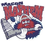 To the right you will find the
original Macon Mayhem logo. Sort of. I've desaturated the color here
because the non-desaturated version literally makes my eyes hurt. I
come back to the pages on this site way too often to want to deal with
that. Um, I mean, I'm far too concerned with the welfare of my readers
to subject you to the logo without desaturating it. That sounds a lot
better, doesn't it? Yeah, that's it: I'm only thinking of you, dear
reader.
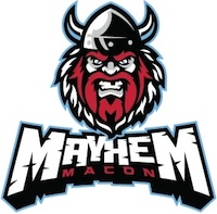
To the right you will find the
original Macon Mayhem logo. Sort of. I've desaturated the color here
because the non-desaturated version literally makes my eyes hurt. I
come back to the pages on this site way too often to want to deal with
that. Um, I mean, I'm far too concerned with the welfare of my readers
to subject you to the logo without desaturating it. That sounds a lot
better, doesn't it? Yeah, that's it: I'm only thinking of you, dear
reader.
While the fact that it was literally an eyesore was easily the biggest problem, there were definitely other issues here. One of them was that Vikings aren't really a good representation of mayhem. But of course "mayhem" is one of those abstract concepts that are always tricky to make good logos for. A Viking may not be a good representation, but is there anything better, or is this the least bad option?
As I was in the early stages of working on this review, I decided to get some input on this from my wife. Imagine, I asked her, that you've been tasked with coming up with a few ways to represent mayhem in a sports logo. No wordmarks allowed, I said; it has to be something concrete.
She came up with puppies.
This may sound like an idea coming from someone who doesn't understand sports and trying to get cutesy. It is not. First of all, she does understand sports and she is not in the habit of being cutesy. Second, the other things she came up (bear, raccoon, gremlin) with were not nearly so cute. And third, it's actually a brilliant idea, and I'm not just saying that to suck up to my wife (that would require a level of self-preservation instinct that I do not possess). Have you ever lived in a house with a puppy, or (worse yet) a few puppies? If so, you should know what I'm talking about. Puppies may be cute, but they fuck shit up.
After getting her suggestions, I explained what the team actually used and asked her what she thought. Here, I got thrown for a bit of a loop, and the conversation turned into a bit of a semantics quibbling session about just what the word mayhem means. My wife sees it as a particular level of damage; mayhem involves things getting ruined but not destroyed. I, on the other hand, feel that it could indeed involve things getting destroyed; to me, the main thing about mayhem is that it's random. That's why I don't think Vikings are a good representation. Vikings were actually quite organized. They weren't mindless, slobbering agents of chaos and destruction. That's what puppies are.
So the conversation sort of wandered down a rabbit hole at this point. But it still helped me realize the problem with the new logo. In fact, it made me realize that there's a case to be made that the old logo is actually better than the new one.
In many ways the new logo is undeniably an improvement. This one is actually drawn well, looking like an actual person instead of looking like the model sheet of a rejected Hanna-Barbera cartoon character. Now the Viking is looking the viewer head-on, a perspective that (as I've noted several times before) is very compelling. The royal blue has given way to sky blue, which may technically be a weaker color but doesn't clash nearly so much with the bright red. The Viking's body is gone, and with it the goofy-ass hockey stick that looked like it was made of petrified wood and had a blade that formed a ninety degree angle with the shaft. For all of these reasons, the new logo is a much cleaner, much better-drawn logo.
But it's also, you know, a Viking. Yeah, but so's the old one, right? Well, I never gave it much thought before, but maybe not. The old logo's "Viking" didn't actually look like a Viking. After all, Viking civilization may have been brutal, but it was still a civilization. Vikings knew how to make clothes. They knew how to cut hair. The "Viking" in the old logo doesn't look like a person with any civilization. It looks more like some bestial Neanderthal (and that's unfair to Neanderthals; even they had more civilization than this lout) that wrapped a dead animal around himself (I'm not sure he even skinned it first) for clothing, and then came across a Viking helmet that somehow fell backwards in time and put it on because it looked shiny and cool. I'd explain the petrified-wood hockey stick, but I have no explanation for the petrified-wood hockey stick. I'm fairly certain the petrified-wood hockey stick defies explanation.
And since the old logo's "Viking" isn't really a Viking, it is actually more fitting despite being utterly hideous. The new logo certainly looks better, but it loses something in the process. And truth be told, it probably is still a better logo, if only because "don't cause the viewer pain" is surely a more basic rule than "be appropriate to the team name". But even if it is a better logo, it is not an improvement. I'm not sure how this can be the case, but nevertheless it is.
I'd still rather they use puppies.
Final Score: 41 points.
Penalties: Singular, 6 pts; Alliteration, 2 pts; Cartoon, 17 pts;
Irrelevance, 14 pts; Name-Logo, 2 pts.
Bonuses: None.