

HOME
BASEBALL
OTHER
FEEDBACK
RULES
RANKINGS
HISTORY
TEAMS
Teams with asterisks are not yet posted
Abbotsford Canucks
Adirondack Thunder
Allen Americans
Atlanta Gladiators
Bakersfield Condors
Belleville Senators
Birmingham Bulls
Bloomington Bison
Bridgeport Islanders
Calgary Wranglers
Charlotte Checkers
Chicago Wolves
Cincinnati Cyclones
Cleveland Monsters
Coachella Valley Firebirds
Colorado Eagles
Evansville Thunderbolts
Fayetteville Marksmen
Florida Everblades
Fort Wayne Komets
Grand Rapids Griffins
Greensboro Gargoyles
Greenville Swamp Rabbits
Hartford Wolf Pack
Henderson Silver Knights
Hershey Bears
Huntsville Havoc
Idaho Steelheads
Indy Fuel
Iowa Heartlanders
Iowa Wild
Jacksonville Icemen
Kalamazoo Wings
Kansas City Mavericks
Knoxville Ice Bears
Lehigh Valley Phantoms
Lions de Trois-Rivières
Macon Mayhem
Maine Mariners
Manitoba Moose
Milwaukee Admirals
Newfoundland Growlers
Norfolk Admirals
Ontario Reign
Orlando Solar Bears
Pensacola Ice Flyers
Peoria Rivermen
Providence Bruins
Quad City Storm
Rapid City Rush
Reading Royals
Roanoke Rail Yard Dawgs
Rochester Americans
Rocket de Laval
Rockford IceHogs
San Diego Gulls
San Jose Barracuda
Savannah Ghost Pirates
South Carolina Stingrays
Springfield Thunderbirds
Syracuse Crunch
Tahoe Knight Monsters
Texas Stars
Toledo Walleye
Toronto Marlies
Tucson Roadrunners
Tulsa Oilers
Utah Grizzlies
Utica Comets
Wheeling Nailers
Wichita Thunder
Wilkes-Barre/Scranton Penguins
Worcester Railers

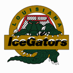
| Louisiana IceGators | 61 |
Notice: All logos on this page are included within the parameters of 17 U.S.C. § 107, which states that the reproduction of a copyrighted work for purposes of criticism and/or comment is not an infringement of copyright. No challenge to the copyrights of these logos is intended by their inclusion here.
Posted 2012 December 13
If there has been an overarching theme for the hockey logos I've reviewed this year, it's that several teams with terrible logos have replaced them with bad logos. That has been the case for the Las Vegas Wranglers; it has been the case for the Syracuse Crunch; if you count the old IHL team's logo, it has been the case for the Orlando Solar Bears. (It is not the case for the Pensacola Ice Flyers; their new logo is actually good.) And, as you can see here, it is the case for the Louisiana IceGators.
 The previous logo, as you can see,
had several issues with it. The color scheme made it hard to see
exactly what was going on (particularly on a dark jersey). Once you
finally did figure out what was going out, you could see that the
position of the alligator was anatomically impossible, that the
perspective of the net only made sense if you were viewing the logo from
below the ice (which would require the alligator to be frozen in the
ice), and that the font that "IceGators" was written in looked like
something out of a 1,000-fonts-for-$9.99 CD. It failed on just about
every level.
The previous logo, as you can see,
had several issues with it. The color scheme made it hard to see
exactly what was going on (particularly on a dark jersey). Once you
finally did figure out what was going out, you could see that the
position of the alligator was anatomically impossible, that the
perspective of the net only made sense if you were viewing the logo from
below the ice (which would require the alligator to be frozen in the
ice), and that the font that "IceGators" was written in looked like
something out of a 1,000-fonts-for-$9.99 CD. It failed on just about
every level.
The new logo only fails on a few levels, so I guess we have to regard that as an improvement. The alligator itself is fine. The yellow tongue is obviously inaccurate, but just as obviously an acceptable concession to the team's color scheme. If anything else about the alligator is inaccurate, then I'd have to be more familiar alligators than I am or want to be in order to spot it. It's a properly menacing-looking alligator. If they had just left it at that, they'd have had a decent (if unremarkable) logo. The other items are where they blow it.
There's a minor problem with putting a fade effect in the word "IceGators", but that's forgivable. The real problem here is that stupid swooping puck. I'm not sure just what it is about it that drives me nuts, but something about it does truly drive me nuts. Maybe it's the fact that it's following an impossible trajectory. Maybe it's the way the puck has been deformed. Maybe it's just that I'm sick of seeing a similar effect with baseballs in the logos of independent league baseball teams. Whatever it is, it completely ruins the logo in my book. It makes an otherwise decent logo a bad logo.
But hey, it's still no worse than Las Vegas or Orlando or Syracuse, right?
Final Score: 61 points.
Penalties: Region (egregious), 5 pts; Ice, 9 pts; Compound, 13 pts; Software, 8 pts; Wordplay, 7 pts; Name-Logo, 2 pts; Equip-Logo, 5 pts; Fade, 6 pts; Yucky-Logo, 5 pts; Yucky-Name, 4 pts.
Bonuses: Local, -3 pts.