
HOME
BASEBALL
OTHER
FEEDBACK
RULES
RANKINGS
HISTORY
TEAMS
Teams with asterisks are not yet posted
Abbotsford Canucks
Adirondack Thunder
Allen Americans
Atlanta Gladiators
Bakersfield Condors
Belleville Senators
Birmingham Bulls
Bloomington Bison
Bridgeport Islanders
Calgary Wranglers
Charlotte Checkers
Chicago Wolves
Cincinnati Cyclones
Cleveland Monsters
Coachella Valley Firebirds
Colorado Eagles
Evansville Thunderbolts
Fayetteville Marksmen
Florida Everblades
Fort Wayne Komets
Grand Rapids Griffins
Greenville Swamp Rabbits
Hartford Wolf Pack
Henderson Silver Knights
Hershey Bears
Huntsville Havoc
Idaho Steelheads
Indy Fuel
Iowa Heartlanders
Iowa Wild
Jacksonville Icemen
Kalamazoo Wings
Kansas City Mavericks
Knoxville Ice Bears
Lehigh Valley Phantoms
Lions de Trois-Rivières
Macon Mayhem
Maine Mariners
Manitoba Moose
Milwaukee Admirals
Newfoundland Growlers
Norfolk Admirals
Ontario Reign
Orlando Solar Bears
Pensacola Ice Flyers
Peoria Rivermen
Providence Bruins
Quad City Storm
Rapid City Rush
Reading Royals
Roanoke Rail Yard Dawgs
Rochester Americans
Rocket de Laval
Rockford IceHogs
San Diego Gulls
San Jose Barracuda
Savannah Ghost Pirates
South Carolina Stingrays
Springfield Thunderbirds
Syracuse Crunch
Tahoe Knight Monsters
Texas Stars
Toledo Walleye
Toronto Marlies
Tucson Roadrunners
Tulsa Oilers
Utah Grizzlies
Utica Comets
Wheeling Nailers
Wichita Thunder
Wilkes-Barre/Scranton Penguins
Worcester Railers

| Abbotsford Canucks | 25 |
Notice: All logos on this page are included within the parameters of 17 U.S.C. § 107, which states that the reproduction of a copyrighted work for purposes of criticism and/or comment is not an infringement of copyright. No challenge to the copyrights of these logos is intended by their inclusion here.
Posted 2021 December 17
Those of us who are particularly interested in minor league hockey history know that the Vancouver Canucks started out as a minor league team in the Pacific Coast Hockey League back in 1945. They spent seven years in the PCHL, at which point the PCHL merged with the Western Canada Senior Hockey League to form the original Western Hockey League (which has nothing to do with the junior league that uses that name today). For all intents and purposes, the WHL Canucks and the NHL Canucks are the same team, since the NHL Canucks were founded by the owners of the WHL Canucks. This makes the Canucks the seventh-oldest team in the NHL, despite there being twelve teams (eleven of them still around) in the NHL when they joined.
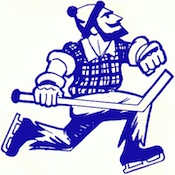
 The WHL Canucks used a drawing of
"Johnny Canuck", the personification of Canada, as their logo. Johnny
Canuck was a lumberjack, so using him in the logo basically meant
drawing a lumberjack with hockey gloves, skates, and a stick. It is, as
you can see, not a great logo. But in its defense, I would point out
two things. One, about the only way you could make a more Canadian
drawing would be if you put a Tim Horton's in the background. Two, it's
not like any of the NHL Canucks logos have been any better.
So when the Vancouver Canucks put their AHL team in Abbotsford and named them the Abbotsford Canucks, they went back and updated the old WHL Canucks logo for the AHL team. Even though the changes are rather slight, the results are so, so much better. First of all, the simple matter of tilting the logo a bit makes it look much less ridiculous. In the old logo, he looked like he was running instead and skating, and he appeared to be gazing off into the clouds. Now he actually looks like he's skating and is looking where he's going. They also got rid of the plaid and gave him a team-color-appropriate green outfit of green shirt with blue pants and suspenders. Before looking at this, I wouldn't have believed you could make a good logo by updating the old WHL Canucks logo. But this proves you can.
I'd almost go so far as to say they should replace the NHL Canucks logo with this, but I don't think I'm willing to go quite that far. While this logo is good, there is still something undeniably minor league about it. For one thing, the logo actually shows a hockey player. There are nearly two dozen logos in minor league hockey that show a hockey player, but just two in the NHL: the Arizona Coyotes and Pittsburgh Penguins. Furthermore, the Coyote is so stylized that it doesn't look like a hockey player even though that's undeniably what it is. As for the Penguins, I know a lot of people like it (I don't), but most of them are quite upfront that the thing they love about it is that is looks kind of ridiculous. So I wouldn't suggest the NHL Canucks actually replace their orca logo with Johnny Canuck.
But Johnny Canuck is in fact the better logo of the two.
Final Score: 25 points.
Penalties: Equip-Logo (quadruply-egregious), 25 pts; Offspring, 5 pts.
Bonuses: None.