

HOME
BASEBALL
OTHER
FEEDBACK
RULES
RANKINGS
HISTORY
TEAMS
Teams with asterisks are not yet posted
Abbotsford Canucks
Adirondack Thunder
Allen Americans
Atlanta Gladiators
Bakersfield Condors
Belleville Senators
Birmingham Bulls
Bloomington Bison
Bridgeport Islanders
Calgary Wranglers
Charlotte Checkers
Chicago Wolves
Cincinnati Cyclones
Cleveland Monsters
Coachella Valley Firebirds
Colorado Eagles
Evansville Thunderbolts
Fayetteville Marksmen
Florida Everblades
Fort Wayne Komets
Grand Rapids Griffins
Greensboro Gargoyles
Greenville Swamp Rabbits
Hartford Wolf Pack
Henderson Silver Knights
Hershey Bears
Huntsville Havoc
Idaho Steelheads
Indy Fuel
Iowa Heartlanders
Iowa Wild
Jacksonville Icemen
Kalamazoo Wings
Kansas City Mavericks
Knoxville Ice Bears
Lehigh Valley Phantoms
Lions de Trois-Rivières
Macon Mayhem
Maine Mariners
Manitoba Moose
Milwaukee Admirals
Newfoundland Growlers
Norfolk Admirals
Ontario Reign
Orlando Solar Bears
Pensacola Ice Flyers
Peoria Rivermen
Providence Bruins
Quad City Storm
Rapid City Rush
Reading Royals
Roanoke Rail Yard Dawgs
Rochester Americans
Rocket de Laval
Rockford IceHogs
San Diego Gulls
San Jose Barracuda
Savannah Ghost Pirates
South Carolina Stingrays
Springfield Thunderbirds
Syracuse Crunch
Tahoe Knight Monsters
Texas Stars
Toledo Walleye
Toronto Marlies
Tucson Roadrunners
Tulsa Oilers
Utah Grizzlies
Utica Comets
Wheeling Nailers
Wichita Thunder
Wilkes-Barre/Scranton Penguins
Worcester Railers
| Huntsville Havoc | 61 |
Notice: All logos on this page are included within the parameters of 17 U.S.C. § 107, which states that the reproduction of a copyrighted work for purposes of criticism and/or comment is not an infringement of copyright. No challenge to the copyrights of these logos is intended by their inclusion here.
Posted 2024 February 16
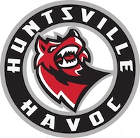
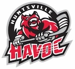 The current Huntsville Havoc logo is an update on their original logo, which you can see to the right. The original logo, as I explained at great length in the previous review, was terrible. As you can imagine, I don't consider the new one to be much of an improvement.
They have, to be fair, gotten rid of a couple of the more ridiculous things — the gloves with claws, the name with scratch marks through it — but the essential problem remains intact: the logo features a fire engine red werewolf at a bizarre angle with odd foreshortening. I've never been quite sure why a werewolf is supposed to represent the concept of havoc, although it's not like there's a good way to draw havoc, so I suppose it's as good as anything else. Or, more accurately, anything else would be just as bad.
Because this logo doesn't include the entire werewolf, a decision had to be made about how much of it to show. They could have simply kept the portion of the werewolf that fit inside the circle that now forms the outer boundary of the logo, but for some reason they decided not to do that. Instead, we've got a disembodied head which looks like decapitation occurred at the base of the neck. You don't see blood dripping out or anything, but it's a stylized drawing and the whole thing is red anyway, so I'm not convinced it isn't actually there in an implied sort of way.
The result is a logo that is somehow horrifying and boring at the same time. That really shouldn't be possible, but that's the only way I know to describe this logo.
Final Score: 61 points.
Penalties: Singular, 6 pts; Alliteration, 2 pts; Cartoon, 17 pts;
Anthropomorphization, 10 pts; Irrelevance, 14 pts; Name-Logo, 2 pts;
Yucky-Logo, 5 pts; Yucky-Name, 5 pts.
Bonuses: None.