

HOME
BASEBALL
OTHER
FEEDBACK
FRIENDS AND FAVORITES
RULES
RANKINGS
HISTORY
TEAMS
Teams with asterisks are not yet posted
Abbotsford Canucks
Adirondack Thunder
Allen Americans
Atlanta Gladiators
Bakersfield Condors
Belleville Senators
Birmingham Bulls
Bridgeport Islanders
Calgary Wranglers
Charlotte Checkers
Chicago Wolves
Cincinnati Cyclones
Cleveland Monsters
Coachella Valley Firebirds
Colorado Eagles
Evansville Thunderbolts
Fayetteville Marksmen
Florida Everblades
Fort Wayne Komets
Grand Rapids Griffins
Greenville Swamp Rabbits
Hartford Wolf Pack
Henderson Silver Knights
Hershey Bears
Huntsville Havoc
Idaho Steelheads
Indy Fuel
Iowa Heartlanders
Iowa Wild
Jacksonville Icemen
Kalamazoo Wings
Kansas City Mavericks
Knoxville Ice Bears
Lehigh Valley Phantoms
Lions de Trois-Rivières
Macon Mayhem
Maine Mariners
Manitoba Moose
Milwaukee Admirals
Newfoundland Growlers
Norfolk Admirals
Ontario Reign
Orlando Solar Bears
Pensacola Ice Flyers
Peoria Rivermen
Providence Bruins
Quad City Storm
Rapid City Rush
Reading Royals
Roanoke Rail Yard Dawgs
Rochester Americans
Rocket de Laval
Rockford IceHogs
San Diego Gulls
San Jose Barracuda
Savannah Ghost Pirates
South Carolina Stingrays
Springfield Thunderbirds
Syracuse Crunch
Texas Stars
Toledo Walleye
Toronto Marlies
Tucson Roadrunners
Tulsa Oilers
Utah Grizzlies
Utica Comets
Wheeling Nailers
Wichita Thunder
Wilkes-Barre/Scranton Penguins
Worcester Railers
| Peoria Rivermen | 24 |
Notice: All logos on this page are included within the parameters of 17 U.S.C. § 107, which states that the reproduction of a copyrighted work for purposes of criticism and/or comment is not an infringement of copyright. No challenge to the copyrights of these logos is intended by their inclusion here.
Posted 2024 February 29
 For all that things change with
the Peoria Rivermen, they really don't change much.
For all that things change with
the Peoria Rivermen, they really don't change much.
First of all, there have actually been several different teams in Peoria over the last forty years, but they've all been called the Rivermen, and at least three of them were at some point in their existence owned by the same guy. It starts with the Peoria Prancers, an expansion team who joined the International Hockey League in 1982. Two years later the arena took over the team, and that was the debut of the Riverman name. Then a guy named Bruce Saurs bought the team. In 1996, after years of losses, he sold half of his stake in that team (it then moved to San Antonio and folded a couple of years later) and founded an ECHL team with the same name. Then he sold the ECHL team, and in 2005 the new owners bought an AHL team in Massachusetts, moved it to Peoria, folded the ECHL team, and named the AHL team the Rivermen. Somewhere along the way the Vancouver Canucks bought the AHL team and moved them to Utica (today that team is the Abbotsford Canucks). So Bruce Saurs came back and formed the SPHL team with a couple of former team executives.
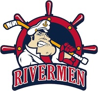
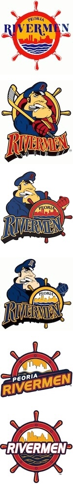
Then there are the logos. As you can see, there have really only been two over the years. The first featured the Peoria skyline as seen from across the Illinois River surrounded by a ship's wheel. That was the original IHL logo. Then came the second IHL logo and the first logo to feature "The Captain", who was holding a hockey stick, chomping on a hockey puck in his mouth, and standing in front of ship's wheel.
When the team moved to the ECHL, the team picked a new logo which was basically a combination of the two AHL logos: The Captain remained, but now he was holding a ship's wheel which once again had the Peoria skyline inside it. (The wordmark from the second IHL logo remained as well.) When the AHL team debuted, the logo remained the same except that the colors changed.
Then came the SPHL team, and the team returned to a variation of the original logo, or at least the top half of it. It was a much better logo (let's be honest, the original logo looks pretty amateurish; the new ones look quite professional), and part of that is that the bottom half of the ship's wheel was removed. Then the team decided to put the bottom half back, which was a step in the wrong direction in my opinion but still a lot better than the original.
And now the Captain is back. He's wearing white this time instead of the blue all of his previous incarnations wore, and he's back to holding a hockey stick while standing in front of a ship's wheel. There are a couple of other differences — the cap now features an anchor instead of a capital R, he's no longer holding a puck with his teeth — but you don't have to look closely to see this is the same huge-nosed, huge-chinned Captain as before.
Personally, I was never fond of the Captain. Maybe it's because he looks like a descendant of the Hapsburgs with that nose and jaw. (Go look for a painting of Charles II of Spain if you don't know what I'm talking about.) Maybe it's the vaguely crazed facial expression, which now that I think about it looks like Charles II as well. I mean, let's face it, when a genetic defect caused by several generations of inbreeding on a level that puts any jokes about Tennessee to shame* gives you an underbite so extreme you can hardly chew, there's only so many facial expressions you can make.
But whatever it is, I personally prefer the logos without the Captain...who, I should note, I can't help but think of now as "Captain Chucky". I'm especially fond of the first one used by the SPHL team. It's not exciting, but it's not goofy, either. It conveys the idea of a riverman without resorting to cartoon characters or other silliness. It has an elegance to it.
Which is more than I can say for Captain Chucky's chin.
| * | Just how bad was the inbreeding that resulted in Charles II? If you want to see just how little his family tree branches, you can check it out on Wikipedia's page about him. But to illustrate how bad it was, let's look at all the different way's Philip I of Castile was Spanish Chucky's ancestor. Philip I was Chuck's...
|
Final Score: 24 points.
Penalties: Cartoon, 17 pts; Name-Logo, 2 pts; Equip-Logo (egregious), 8 pts.
Bonuses: Local, -3 pts.