

HOME
BASEBALL
OTHER
FEEDBACK
RULES
RANKINGS
HISTORY
TEAMS
Teams with asterisks are not yet posted
Abbotsford Canucks
Adirondack Thunder
Allen Americans
Atlanta Gladiators
Bakersfield Condors
Belleville Senators
Birmingham Bulls
Bloomington Bison
Bridgeport Islanders
Calgary Wranglers
Charlotte Checkers
Chicago Wolves
Cincinnati Cyclones
Cleveland Monsters
Coachella Valley Firebirds
Colorado Eagles
Evansville Thunderbolts
Fayetteville Marksmen
Florida Everblades
Fort Wayne Komets
Grand Rapids Griffins
Greensboro Gargoyles
Greenville Swamp Rabbits
Hartford Wolf Pack
Henderson Silver Knights
Hershey Bears
Huntsville Havoc
Idaho Steelheads
Indy Fuel
Iowa Heartlanders
Iowa Wild
Jacksonville Icemen
Kalamazoo Wings
Kansas City Mavericks
Knoxville Ice Bears
Lehigh Valley Phantoms
Lions de Trois-Rivières
Macon Mayhem
Maine Mariners
Manitoba Moose
Milwaukee Admirals
Newfoundland Growlers
Norfolk Admirals
Ontario Reign
Orlando Solar Bears
Pensacola Ice Flyers
Peoria Rivermen
Providence Bruins
Quad City Storm
Rapid City Rush
Reading Royals
Roanoke Rail Yard Dawgs
Rochester Americans
Rocket de Laval
Rockford IceHogs
San Diego Gulls
San Jose Barracuda
Savannah Ghost Pirates
South Carolina Stingrays
Springfield Thunderbirds
Syracuse Crunch
Tahoe Knight Monsters
Texas Stars
Toledo Walleye
Toronto Marlies
Tucson Roadrunners
Tulsa Oilers
Utah Grizzlies
Utica Comets
Wheeling Nailers
Wichita Thunder
Wilkes-Barre/Scranton Penguins
Worcester Railers
| Wichita Thunder | 15 |
Notice: All logos on this page are included within the parameters of 17 U.S.C. § 107, which states that the reproduction of a copyrighted work for purposes of criticism and/or comment is not an infringement of copyright. No challenge to the copyrights of these logos is intended by their inclusion here.
Posted 2024 November 24
NOTE: This review incorporates text from the previous review for the Thunder, which was posted 2007 March 24.
I will never understand why anyone thinks Thunder is a good team name.
I understand the concept of naming teams after weather phenomena, of course. You want to name your team after something powerful, and many weather phenomena fit the bill. Hurricanes do billions of dollars of damage, sometimes over tens of thousands of square miles. Tornados are more concentrated but more deadly (and can send people to a land of munchkins and witches to boot). Blizzards and Storms are similarly dangerous. Even Fog is treacherous when it gets bad. And Lightning might not cause damage on such a grand scale, but given the fact that lightning is literally hotter than surface of the sun, it's obviously powerful.
But then there's thunder. Thunder, unlike all the others, doesn't actually do anything. The reason for this is that thunder is nothing more than a sound effect accompanying another weather pattern. The worst thunder is ever going to do to you is screw up your hearing. And if you're close enough to the thunder for it to do that, then you have more important things to worry about — for example, the lightning you're standing so close to. That's the dangerous part. Calling a team Thunder on the grounds that lightning is dangerous is a little bit akin to deciding that since having a sixteen-ton weight fall on you is dangerous, you should name a team the Squish.
Nonetheless, the name is popular enough that Wichita's team has shared the name with two different teams — first Las Vegas in the now-defunct International Hockey League, and today with Adirondack (formerly Stockton) of the ECHL. Yes, that's right: there are two teams right now in the ECHL called the Thunder. It couldn't be one of the cool names in the league that gets used multiple times, like Stingrays or the Gladiators. Nope, it's Thunder. Yawn.
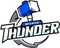
Teams calling themselves the Thunder often run into the same problem, which is that it's hard to draw a sound effect. As a result a lot of the teams put lightning in the logo, which raises the obvious question of why they didn't name themselves the Lightning in the first place ("Wichita Lightning", in particular, has a nice ring to it). Of course, it's a little tricky making a great logo based on lightning, too. Look at the Tampa Bay Lightning as an example: The lightning bolt is straightforward enough, but by itself it looked like someting in the Wingdings font, so they tried sprucing it up with a circle that really didn't do anything to spruce it up. So lightning bolts aren't really the way to go for a team named the Thunder.
Wichita wisely avoids making a lightning bolt the centerpiece of their logo (although they do foolishly still have one...more on this in a bit). Instead, they do the same thing the Adirondack Thunder do, and look to Norse mythology for inspiration. Adirondack puts Thor himself into their logo. Wichita puts his hammer. Does that work? I'm going say...maybe? It makes for a reasonably clean logo. And I suppose given all the recent Marvel movies most people understand the association between a hammer and Thor. But going from hammer to Thor to thunder seems like way too many steps for people to go through just to understand a sport team's logo. It's not nearly as straightforward as, say, the bear in the logo for the Hershey Bears.
Back to the lightning bolt. It's one of the oddest-looking lightning bolts I've ever seen, because its circular. I think the idea is that it serves as "action lines" indicating movement on the part of the hammer. It doesn't convey that very well, though. It looks more like a gear that got glued to the back of the hammer for some odd reason. It's just weird.
And if that wasn't weird enough, look closely at the part of the lightning bolt closest to the hammer. Yep, that's a little lightning bolt drawn on the lightning bolt. Apparently even the person who designed this logo was worried the (big) lightning bolt didn't look like a lightning bolt, so they added a second one. If that's not a tacit admission that the logo isn't working, I don't know what is.
But again, the problem isn't the logo designer. It's the name. No matter how many teams do it, naming your team Thunder just doesn't work.
Final Score: 15 points.
Penalties: Singular, 6 pts; Irrelevance (half penalty), 7 pts;
Name-Logo, 2 pts.
Bonuses: None.