

HOME
HOCKEY
OTHER
RULES
RANKINGS
HISTORY
TEAMS
Teams with asterisks are not yet posted
Acereros del Norte
Águila de Veracruz
Aigles de Trois-Rivières
Akron RubberDucks
Albuquerque Isotopes
Algodoneros de Unión Laguna
Altoona Curve
Amarillo Sod Poodles
Arkansas Travelers
Asheville Tourists
Augusta GreenJackets
Beloit Sky Carp
Billings Mustangs*
Biloxi Shuckers
Binghamton Rumble Ponies
Birmingham Barons
Boise Hawks
Bowling Green Hot Rods
Bradenton Marauders
Bravos de León
Brooklyn Cyclones
Buffalo Bisons
Caliente de Durango
Capitales de Quebec
Cedar Rapids Kernels
Charleston Dirty Birds
Charleston RiverDogs
Charlotte Knights
Charros de Jalisco
Chattanooga Lookouts
Chesapeake Baysox
Chicago Dogs
Clearwater Threshers
Cleburne Railroaders*
Columbia Fireflies
Columbus Clippers
Columbus Clingstones
Conspiradores de Querétaro
Corpus Christi Hooks*
Dayton Dragons
Daytona Tortugas
Delmarva Shorebirds
Diablos Rojos del México
Dorados de Chihuahua
Down East Bird Dawgs
Dunedin Blue Jays
Durham Bulls
El Paso Chihuahuas
Erie SeaWolves
Eugene Emeralds
Evansville Otters
Everett AquaSox
Fargo-Moorhead RedHawks
Fayetteville Woodpeckers
Florence Y'Alls
Fort Myers Mighty Mussels
Fort Wayne TinCaps
Frederick Keys*
Fredericksburg Nationals
Fresno Grizzlies
Frisco RoughRiders
Gary SouthShore RailCats
Gastonia Ghost Peppers
Gateway Grizzlies
Glacier Range Riders
Great Falls Voyagers
Great Lakes Loons
Greensboro Grasshoppers
Greenville Drive
Guerreros de Oaxaca
Gwinnett Stripers
Hagerstown Flying Boxcars
Harrisburg Senators
Hartford Yard Goats
Hickory Crawdads
High Point Rockers
Hill City Howlers*
Hillsboro Hops
Hub City Spartanburgers
Hudson Valley Renegades
Idaho Falls Chukars*
Indianapolis Indians*
Inland Empire 66ers of San
Bernardino
Iowa Cubs
Jacksonville Jumbo Shrimp
Jersey Shore BlueClaws
Joliet Slammers
Jupiter Hammerheads
Kane County Cougars
Kannapolis Cannon Ballers
Kansas City Monarchs
Knoxville Smokies
Lake County Captains*
Lake Country DockHounds
Lake Elsinore Storm*
Lake Erie Crushers
Lakeland Flying Tigers
Lancaster Stormers
Lansing Lugnuts
Las Vegas Aviators
Lehigh Valley IronPigs
Leones de Yucatán
Lexington Legends
Lincoln Saltdogs
Long Beach Coast
Long Island Ducks
Louisville Bats
Memphis Redbirds
Midland RockHounds
Milwaukee Milkmen
Mississippi Mud Monsters
Missoula Paddleheads
Modesto Roadsters
Montgomery Biscuits
Myrtle Beach Pelicans
Nashville Sounds
New England Knockouts
New Hampshire Fisher Cats
New Jersey Jackals
New York Boulders
Norfolk Tides
Northwest Arkansas Naturals
Oakland Ballers
Ogden Raptors
Oklahoma City Comets
Olmecas de Tabasco*
Omaha Storm Chasers
Ontario Tower Buzzers*
Ottawa Titans
Palm Beach Cardinals
Pensacola Blue Wahoos
Peoria Chiefs
Pericos de Puebla
Piratas de Campeche
Portland Sea Dogs
Quad City River Bandits
Rancho Cucamonga Quakes
Reading Fightin Phils
Reno Aces
Richmond Flying Squirrels*
Rieleros de Aguascalientes*
Rochester Red Wings
Rocket City Trash Pandas
Rome Emperors
Round Rock Express
Sacramento River Cats
Salem Ridge Yaks*
Salt Lake Bees*
San Antonio Missions
San Jose Giants
Saraperos de Saltillo
Schaumburg Boomers
Scranton/Wilkes-Barre RailRiders
Sioux City Explorers
Sioux Falls Canaries
Somerset Patriots
South Bend Cubs
Southern Maryland Blue Crabs
Spokane Indians
Springfield Cardinals
St. Lucie Mets
St. Paul Saints*
Staten Island FerryHawks
Stockton Ports
Sugar Land Skeeters
Sultanes de Monterrey
Sussex County Miners
Syracuse Mets
Tacoma Rainiers
Tampa Tarpons
Tecolotes de los Dos Laredos
Tigres de Quintana Roo
Toledo Mud Hens
Toros de Tijuana
Tri-City Dust Devils
Tri-City ValleyCats
Tulsa Drillers
Vancouver Canadians
Visalia Rawhide
Washington Wild Things
West Michigan Whitecaps
Wichita Wind Surge
Wilmington Blue Rocks
Wilson Warbirds*
Windy City Thunderbolts*
Winnipeg Goldeyes
Winston-Salem Dash
Wisconsin Timber Rattlers
Worcester Red Sox
York Revolution
Yuba-Sutter Freebirds*
| Biloxi Shuckers | 163 |
Notice: All logos on this page are included within the parameters of 17 U.S.C. § 107, which states that the reproduction of a copyrighted work for purposes of criticism and/or comment is not an infringement of copyright. No challenge to the copyrights of these logos is intended by their inclusion here.
Posted 2017 May 21
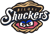
<jaw drop>
Oh. My. God.
This name shucks. The logo is pretty shucking awful, too, but there's not much you can do logowise when your name shucks this bad. What convinced them to pick such an awful name?
Perhaps one could be generous. They did have a fan vote with several other names, and somehow this won. So maybe this is just the result of bad shuck. But then, the team didn't have to let this be an option, so blaming it on the fans would really just be passing the shuck. I'll have no shuck with that.
The other names, incidentally, didn't shuck. The other options were Beacon, Black Jacks, Mullets, Schooners, and Shrimpers. Okay, so they're not all good, either. "Shrimpers" relates to the town, but it's the sort of name that only works if it's been around for decades, which it hasn't (Biloxi has only been home to one other baseball team, the Sand Crabs, who only lasted a single season back in 1908). Mullets is actually a reference to the fish, but you just know that everyone's going to think of the hairstyle. Schooners and Beacon aren't great names but they'd do. Black Jacks is probably the best of the lot, and it's...all right. Okay, fine: all in all this list is pretty shucking lame. There has to be better stuff to name teams after. Their first hockey team was the Mississippi Sea Wolves, and with Biloxi being on the coast I assume that's a reference to something or another. And I'm sure you could come up with some names drawn from all the casinos in town. Names better than "Black Jacks", that is. (Biloxi Sharks would have a nice casino/nautical double meaning.) Given the options at their disposal, it's a shucking shame that list was the best they could manage, even before the worst option on the list won the vote.
But even if we allow for the name, that logo disturbs me. We all know that oysters don't actually have eyes, right? Some do have cells that detect light (others don't even have that), but they're not really eyes. And the eyes in this logo are sitting on what looks more like a tongue than an oyster. Seriously, oysters aren't pink. The coloring of the shell, meanwhile, makes it look like a walnut. So the team name is supposed to be a reference to oysters, but the logo features eyes sitting on a tongue that's been stuffed into a really big walnut. That's some Grand Guignol shit right there, folks.
I think the team just needs to admit this was a mistake and start over. There's no shame in that. We should all be willing to learn from our mistakes and move on. The people in Biloxi need to do that, and then apologize to their fans. "We're sorry, everyone, we really are. Honestly, we don't know what the shuck we were thinking."
Final Score: 163 points.
Penalties: Humanoid (egregious), 61 pts; Irrelevance, 39 pts; Cartoon,
47 pts; Name, 10 pts; Logo, 12 pts.
Bonuses: Local, -6 pts.