

HOME
HOCKEY
OTHER
RULES
RANKINGS
HISTORY
TEAMS
Teams with asterisks are not yet posted
Acereros del Norte
Águila de Veracruz
Aigles de Trois-Rivières
Akron RubberDucks
Albuquerque Isotopes
Algodoneros de Unión Laguna
Altoona Curve
Amarillo Sod Poodles
Arkansas Travelers
Asheville Tourists
Augusta GreenJackets
Beloit Sky Carp
Billings Mustangs*
Biloxi Shuckers
Binghamton Rumble Ponies
Birmingham Barons
Boise Hawks
Bowling Green Hot Rods
Bradenton Marauders
Bravos de León
Brooklyn Cyclones
Buffalo Bisons
Caliente de Durango
Capitales de Quebec
Cedar Rapids Kernels
Charleston Dirty Birds
Charleston RiverDogs
Charlotte Knights
Charros de Jalisco
Chattanooga Lookouts
Chesapeake Baysox
Chicago Dogs
Clearwater Threshers
Cleburne Railroaders
Columbia Fireflies
Columbus Clippers
Columbus Clingstones
Conspiradores de Querétaro
Corpus Christi Hooks
Dayton Dragons
Daytona Tortugas
Delmarva Shorebirds
Diablos Rojos del México
Dorados de Chihuahua
Down East Bird Dawgs
Dunedin Blue Jays
Durham Bulls
El Paso Chihuahuas
Erie SeaWolves
Eugene Emeralds
Evansville Otters
Everett AquaSox
Fargo-Moorhead RedHawks
Fayetteville Woodpeckers
Florence Y'Alls
Fort Myers Mighty Mussels
Fort Wayne TinCaps
Frederick Keys*
Fredericksburg Nationals
Fresno Grizzlies
Frisco RoughRiders
Gary SouthShore RailCats
Gastonia Ghost Peppers
Gateway Grizzlies
Glacier Range Riders
Great Falls Voyagers
Great Lakes Loons
Greensboro Grasshoppers
Greenville Drive
Guerreros de Oaxaca
Gwinnett Stripers
Hagerstown Flying Boxcars
Harrisburg Senators
Hartford Yard Goats
Hickory Crawdads
High Point Rockers
Hill City Howlers*
Hillsboro Hops
Hub City Spartanburgers
Hudson Valley Renegades
Idaho Falls Chukars
Indianapolis Indians
Inland Empire 66ers of San
Bernardino
Iowa Cubs
Jacksonville Jumbo Shrimp
Jersey Shore BlueClaws
Joliet Slammers
Jupiter Hammerheads
Kane County Cougars
Kannapolis Cannon Ballers
Kansas City Monarchs
Knoxville Smokies
Lake County Captains
Lake Country DockHounds
Lake Elsinore Storm*
Lake Erie Crushers
Lakeland Flying Tigers
Lancaster Stormers
Lansing Lugnuts
Las Vegas Aviators
Lehigh Valley IronPigs
Leones de Yucatán
Lexington Legends
Lincoln Saltdogs
Long Beach Coast
Long Island Ducks
Louisville Bats
Memphis Redbirds
Midland RockHounds
Milwaukee Milkmen
Mississippi Mud Monsters
Missoula Paddleheads
Modesto Roadsters
Montgomery Biscuits
Myrtle Beach Pelicans
Nashville Sounds
New England Knockouts
New Hampshire Fisher Cats
New Jersey Jackals
New York Boulders
Norfolk Tides
Northwest Arkansas Naturals
Oakland Ballers
Ogden Raptors
Oklahoma City Comets
Olmecas de Tabasco
Omaha Storm Chasers
Ontario Tower Buzzers*
Ottawa Titans
Palm Beach Cardinals
Pensacola Blue Wahoos
Peoria Chiefs
Pericos de Puebla
Piratas de Campeche
Portland Sea Dogs
Quad City River Bandits
Rancho Cucamonga Quakes
Reading Fightin Phils
Reno Aces
Richmond Flying Squirrels*
Rieleros de Aguascalientes*
Rochester Red Wings
Rocket City Trash Pandas
Rome Emperors
Round Rock Express
Sacramento River Cats
Salem Ridge Yaks
Salt Lake Bees
San Antonio Missions
San Jose Giants
Saraperos de Saltillo
Schaumburg Boomers
Scranton/Wilkes-Barre RailRiders
Sioux City Explorers
Sioux Falls Canaries
Somerset Patriots
South Bend Cubs
Southern Maryland Blue Crabs
Spokane Indians
Springfield Cardinals
St. Lucie Mets
St. Paul Saints
Staten Island FerryHawks
Stockton Ports
Sugar Land Space Cowboys
Sultanes de Monterrey
Sussex County Miners
Syracuse Mets
Tacoma Rainiers
Tampa Tarpons
Tecolotes de los Dos Laredos
Tigres de Quintana Roo
Toledo Mud Hens
Toros de Tijuana
Tri-City Dust Devils
Tri-City ValleyCats
Tulsa Drillers
Vancouver Canadians
Visalia Rawhide
Washington Wild Things
West Michigan Whitecaps
Wichita Wind Surge
Wilmington Blue Rocks
Wilson Warbirds
Windy City Thunderbolts*
Winnipeg Goldeyes
Winston-Salem Dash
Wisconsin Timber Rattlers
Worcester Red Sox
York Revolution
Yuba-Sutter Freebirds
| Lincoln Saltdogs | 74 |
Notice: All logos on this page are included within the parameters of 17 U.S.C. § 107, which states that the reproduction of a copyrighted work for purposes of criticism and/or comment is not an infringement of copyright. No challenge to the copyrights of these logos is intended by their inclusion here.
Posted 2024 June 3
NOTE: This review incorporates text from the previous review for the Saltdogs, which was posted on 2013 May 12.
Just so we're clear on this, the team's name is not Salty Dogs. The team's name is Saltdogs — no y, no space. The "salt" part of the name comes from the fact that there are salt flats nearby. The "dog" part comes from the fact that the original owner had pet dogs. Yes, that's one of those things I throw into these reviews that sounds like a joke but is in fact true. From what I've read, they started with the idea that the team name would be Salt[insert animal here], and pretty soon they had it narrowed down to either Saltdogs or Saltcats, and since the original owner had pet dogs they went with the former.
As you can guess form the above, there is no such thing a salt dog. If you do a web search, you will mostly find references to this team and to salty dogs of various sort (the cocktail, the sailor, and so forth). You will also find some references to the SaltDogg, which is contraption you use to spread salt on a road, sidewalk, whatever. It's a brand name (so another case of a made-up word), and in case you're wondering they range in size from massive, truck-mounted spreaders intended for sale to cities and towns all the way down to little two-wheeled push spreaders that you would presumably use on the walkway from your house to your car. I imagine if you live somewhere like Vermont or North Dakota such a thing could come in handy. Virginia and North Carolina, two states I've lived in? Not so much.
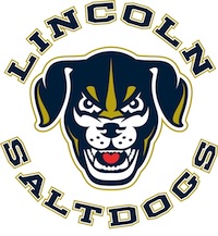
As for the logo, I see what they were going for and I like what they were going for, but I'm afraid they missed the mark. The main element is the head of a dog that's looking right at you. This usually works very well — consider such logos as the AHL Chicago Wolves or the SPHL Birmingham Bulls — but something isn't quite right here. It's aiming to be a fairly realistic rendering, but then they go and make it perfectly symmetrical. It would be a lot stronger, I think, if they added some imperfect elements. In particular, the teeth just don't look natural, and the little heart-shaped, bright red tongue isn't helping either.
Then they write the team name is the standard "sports block letters" font. The font makes it look like a high school team. The fact that the team colors are navy blue and gold (a color scheme which, for whatever reasons, is more common in high school and college sports than pro sports) only heightens the effect.
Don't get me wrong: it's not a bad logo. It's just not nearly as good as it could be. It's almost more frustrating than if it was just a bad logo, because I really feel like just a couple of minor tweaks could make it one of the best logos in minor league baseball. But because they get a few details wrong, that simply isn't the case.
Final Score: 74 points.
Penalties: Compound, 34 pts; Humanoid, 30 pts; Name, 10 pts.
Bonuses: None.