

HOME
HOCKEY
OTHER
RULES
RANKINGS
HISTORY
TEAMS
Teams with asterisks are not yet posted
Acereros del Norte
Águila de Veracruz
Aigles de Trois-Rivières
Akron RubberDucks
Albuquerque Isotopes
Algodoneros de Unión Laguna
Altoona Curve
Amarillo Sod Poodles
Arkansas Travelers
Asheville Tourists
Augusta GreenJackets
Beloit Sky Carp
Billings Mustangs*
Biloxi Shuckers
Binghamton Rumble Ponies
Birmingham Barons
Boise Hawks
Bowling Green Hot Rods
Bradenton Marauders
Bravos de León*
Brooklyn Cyclones
Buffalo Bisons
Caliente de Durango
Capitales de Quebec
Cedar Rapids Kernels
Charleston Dirty Birds
Charleston RiverDogs
Charlotte Knights
Charros de Jalisco
Chattanooga Lookouts
Chesapeake Baysox
Chicago Dogs
Clearwater Threshers
Cleburne Railroaders*
Columbia Fireflies
Columbus Clippers
Columbus Clingstones
Conspiradores de Querétaro
Corpus Christi Hooks*
Dayton Dragons
Daytona Tortugas
Delmarva Shorebirds
Diablos Rojos del México
Dorados de Chihuahua
Down East Bird Dawgs
Dunedin Blue Jays
Durham Bulls
El Paso Chihuahuas
Erie SeaWolves
Eugene Emeralds
Evansville Otters
Everett AquaSox
Fargo-Moorhead RedHawks
Fayetteville Woodpeckers
Florence Y'Alls
Fort Myers Mighty Mussels
Fort Wayne TinCaps
Frederick Keys*
Fredericksburg Nationals
Fresno Grizzlies
Frisco RoughRiders
Gary SouthShore RailCats
Gastonia Ghost Peppers
Gateway Grizzlies
Glacier Range Riders
Great Falls Voyagers
Great Lakes Loons
Greensboro Grasshoppers
Greenville Drive
Guerreros de Oaxaca
Gwinnett Stripers
Hagerstown Flying Boxcars
Harrisburg Senators
Hartford Yard Goats
Hickory Crawdads
High Point Rockers
Hill City Howlers*
Hillsboro Hops
Hub City Spartanburgers
Hudson Valley Renegades
Idaho Falls Chukars*
Indianapolis Indians*
Inland Empire 66ers of San
Bernardino
Iowa Cubs
Jacksonville Jumbo Shrimp
Jersey Shore BlueClaws
Joliet Slammers
Jupiter Hammerheads
Kane County Cougars
Kannapolis Cannon Ballers
Kansas City Monarchs
Knoxville Smokies
Lake County Captains*
Lake Country DockHounds
Lake Elsinore Storm*
Lake Erie Crushers
Lakeland Flying Tigers
Lancaster Stormers
Lansing Lugnuts
Las Vegas Aviators
Lehigh Valley IronPigs
Leones de Yucatán
Lexington Legends
Lincoln Saltdogs
Long Beach Coast*
Long Island Ducks
Louisville Bats
Memphis Redbirds
Midland RockHounds
Milwaukee Milkmen
Mississippi Mud Monsters
Missoula Paddleheads
Modesto Roadsters*
Montgomery Biscuits
Myrtle Beach Pelicans
Nashville Sounds
New England Knockouts
New Hampshire Fisher Cats
New Jersey Jackals
New York Boulders
Norfolk Tides
Northwest Arkansas Naturals
Oakland Ballers
Ogden Raptors
Oklahoma City Comets
Olmecas de Tabasco*
Omaha Storm Chasers
Ontario Tower Buzzers*
Ottawa Titans
Palm Beach Cardinals
Pensacola Blue Wahoos
Peoria Chiefs
Pericos de Puebla
Piratas de Campeche
Portland Sea Dogs
Quad City River Bandits
Rancho Cucamonga Quakes
Reading Fightin Phils
Reno Aces
Richmond Flying Squirrels*
Rieleros de Aguascalientes*
Rochester Red Wings
Rocket City Trash Pandas
Rome Emperors
Round Rock Express
Sacramento River Cats
Salem Ridge Yaks*
Salt Lake Bees*
San Antonio Missions
San Jose Giants
Saraperos de Saltillo
Schaumburg Boomers
Scranton/Wilkes-Barre RailRiders
Sioux City Explorers
Sioux Falls Canaries
Somerset Patriots
South Bend Cubs
Southern Maryland Blue Crabs
Spokane Indians
Springfield Cardinals
St. Lucie Mets
St. Paul Saints*
Staten Island FerryHawks
Stockton Ports
Sugar Land Skeeters
Sultanes de Monterrey
Sussex County Miners
Syracuse Mets
Tacoma Rainiers
Tampa Tarpons
Tecolotes de los Dos Laredos
Tigres de Quintana Roo
Toledo Mud Hens
Toros de Tijuana
Tri-City Dust Devils
Tri-City ValleyCats
Tulsa Drillers
Vancouver Canadians
Visalia Rawhide
Washington Wild Things
West Michigan Whitecaps
Wichita Wind Surge
Wilmington Blue Rocks
Wilson Warbirds*
Windy City Thunderbolts*
Winnipeg Goldeyes
Winston-Salem Dash
Wisconsin Timber Rattlers
Worcester Red Sox
York Revolution
Yuba-Sutter Freebirds*
| State College Spikes | 15 |
Notice: All logos on this page are included within the parameters of 17 U.S.C. § 107, which states that the reproduction of a copyrighted work for purposes of criticism and/or comment is not an infringement of copyright. No challenge to the copyrights of these logos is intended by their inclusion here.
Posted 2012 April 21
State College, Pennsylvania is, predictably, where Pennsylvania State University (formerly Pennsylvania State College) is located. This strikes me as an odd name for a town even if it is where a major university is located. I understand the concept of "college town" and all that, but most college towns still manage to come up with a name other than "Heylookwe'reatownwithacollegeville". I mean, there had to be something else in the area to name a town after, right? A noteworthy hill or creek or forest or something? And aren't colleges supposed to teach thinking skills such as, oh, I don't know, creativity? Unless this was intended as some kind of hipster, more-ironic-than-thou name, there's not a lot of evidence of creativity here. And I don't think there were a lot of hipsters in 1896. But maybe the people in this part of Pennsylvania were just more-ironic-than-thou before it was cool.
(The area's nickname — "Happy Valley" — is considerably better in the creativity department, but that name implies their creativity was aided by...well, by something that would grow in a place called "Happy Valley", if you get my drift.)
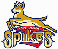
The team name fares a little better in this regard. There's apparently not just a double-meaning, but actually a triple-meaning to the name "Spikes". First, "spikes" is the local term for the short, unbranching antlers founded on young male deer; since this Short-Season "A" team is where many fresh-out-of-college players start their professional baseball career, it's a fitting reference. Second, it's a railroad reference, which makes perfect sense since there aren't any railroads in State College and haven't been for decades. Third, it refers to the cleats on baseball shoes. Okay, so the last two are rather goofy, but the first one is actually clever.
Given the first meaning, the logo actually makes perfect sense. Far from being the irrelevant feature it appears to be at first glance, it is a relevant feature which is given context by showing the entire animal instead of just the antler. This is a good thing; if the name "Spikes" is meant to represent the future of the Pittsburgh Pirates, then having a spike detached from the animal would paint a pretty grim picture of the Pirates' future. And yes, I know that it would probably be pretty accurate given the Pirates' recent history, but you still don't want to admit that in a logo.
The logo is well-drawn as well. Nothing cartoony, and they don't try to make the deer look ridiculously fierce. It has a serious, determined look, but it leaves it at that. There's no baseball equipment in the logo, no distracting scenery in the background. And the logo is balanced without being too symmetrical. All in all, this is a very good logo.
Final Score: 15 points.
Penalties: Reference, 10 pts; Alliteration, 5 pts.
Bonuses: None.