

HOME
HOCKEY
OTHER
RULES
RANKINGS
HISTORY
TEAMS
Teams with asterisks are not yet posted
Acereros del Norte
Águila de Veracruz
Aigles de Trois-Rivières
Akron RubberDucks
Albuquerque Isotopes
Algodoneros de Unión Laguna
Altoona Curve
Amarillo Sod Poodles
Arkansas Travelers
Asheville Tourists
Augusta GreenJackets
Beloit Sky Carp
Billings Mustangs*
Biloxi Shuckers
Binghamton Rumble Ponies
Birmingham Barons
Boise Hawks
Bowling Green Hot Rods
Bradenton Marauders
Bravos de León*
Brooklyn Cyclones
Buffalo Bisons
Caliente de Durango
Capitales de Quebec
Cedar Rapids Kernels
Charleston Dirty Birds
Charleston RiverDogs
Charlotte Knights
Charros de Jalisco
Chattanooga Lookouts
Chesapeake Baysox
Chicago Dogs
Clearwater Threshers
Cleburne Railroaders*
Columbia Fireflies
Columbus Clippers
Columbus Clingstones
Conspiradores de Querétaro
Corpus Christi Hooks*
Dayton Dragons
Daytona Tortugas
Delmarva Shorebirds
Diablos Rojos del México
Dorados de Chihuahua
Down East Bird Dawgs
Dunedin Blue Jays
Durham Bulls
El Paso Chihuahuas
Erie SeaWolves
Eugene Emeralds
Evansville Otters
Everett AquaSox
Fargo-Moorhead RedHawks
Fayetteville Woodpeckers
Florence Y'Alls
Fort Myers Mighty Mussels
Fort Wayne TinCaps
Frederick Keys*
Fredericksburg Nationals
Fresno Grizzlies
Frisco RoughRiders
Gary SouthShore RailCats
Gastonia Ghost Peppers
Gateway Grizzlies
Glacier Range Riders
Great Falls Voyagers
Great Lakes Loons
Greensboro Grasshoppers
Greenville Drive
Guerreros de Oaxaca
Gwinnett Stripers
Hagerstown Flying Boxcars
Harrisburg Senators
Hartford Yard Goats
Hickory Crawdads
High Point Rockers
Hill City Howlers*
Hillsboro Hops
Hub City Spartanburgers
Hudson Valley Renegades
Idaho Falls Chukars*
Indianapolis Indians*
Inland Empire 66ers of San
Bernardino
Iowa Cubs
Jacksonville Jumbo Shrimp
Jersey Shore BlueClaws
Joliet Slammers
Jupiter Hammerheads
Kane County Cougars
Kannapolis Cannon Ballers
Kansas City Monarchs
Knoxville Smokies
Lake County Captains*
Lake Country DockHounds
Lake Elsinore Storm*
Lake Erie Crushers
Lakeland Flying Tigers
Lancaster Stormers
Lansing Lugnuts
Las Vegas Aviators
Lehigh Valley IronPigs
Leones de Yucatán
Lexington Legends
Lincoln Saltdogs
Long Beach Coast*
Long Island Ducks
Louisville Bats
Memphis Redbirds
Midland RockHounds
Milwaukee Milkmen
Mississippi Mud Monsters
Missoula Paddleheads
Modesto Roadsters*
Montgomery Biscuits
Myrtle Beach Pelicans
Nashville Sounds
New England Knockouts
New Hampshire Fisher Cats
New Jersey Jackals
New York Boulders
Norfolk Tides
Northwest Arkansas Naturals
Oakland Ballers
Ogden Raptors
Oklahoma City Comets
Olmecas de Tabasco*
Omaha Storm Chasers
Ontario Tower Buzzers*
Ottawa Titans
Palm Beach Cardinals
Pensacola Blue Wahoos
Peoria Chiefs
Pericos de Puebla
Piratas de Campeche
Portland Sea Dogs
Quad City River Bandits
Rancho Cucamonga Quakes
Reading Fightin Phils
Reno Aces
Richmond Flying Squirrels*
Rieleros de Aguascalientes*
Rochester Red Wings
Rocket City Trash Pandas
Rome Emperors
Round Rock Express
Sacramento River Cats
Salem Ridge Yaks*
Salt Lake Bees*
San Antonio Missions
San Jose Giants
Saraperos de Saltillo
Schaumburg Boomers
Scranton/Wilkes-Barre RailRiders
Sioux City Explorers
Sioux Falls Canaries
Somerset Patriots
South Bend Cubs
Southern Maryland Blue Crabs
Spokane Indians
Springfield Cardinals
St. Lucie Mets
St. Paul Saints*
Staten Island FerryHawks
Stockton Ports
Sugar Land Skeeters
Sultanes de Monterrey
Sussex County Miners
Syracuse Mets
Tacoma Rainiers
Tampa Tarpons
Tecolotes de los Dos Laredos
Tigres de Quintana Roo
Toledo Mud Hens
Toros de Tijuana
Tri-City Dust Devils
Tri-City ValleyCats
Tulsa Drillers
Vancouver Canadians
Visalia Rawhide
Washington Wild Things
West Michigan Whitecaps
Wichita Wind Surge
Wilmington Blue Rocks
Wilson Warbirds*
Windy City Thunderbolts*
Winnipeg Goldeyes
Winston-Salem Dash
Wisconsin Timber Rattlers
Worcester Red Sox
York Revolution
Yuba-Sutter Freebirds*
| Winnipeg Goldeyes | 116 |
Notice: All logos on this page are included within the parameters of 17 U.S.C. § 107, which states that the reproduction of a copyrighted work for purposes of criticism and/or comment is not an infringement of copyright. No challenge to the copyrights of these logos is intended by their inclusion here.
Posted 2024 May 12
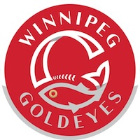
Goldeyes are a fish, of course — they'd just about have to be with a name like goldeye. Apparently it's commonly smoked, and because it's typically smoked in a particular fashion first developed in Winnipeg, the result is commonly called Winnipeg goldeye. In other words, this is a name along the lines of Texas Barbecue or Philadelphia Cheesesteaks, except that no one has ever been foolish enough to use one of those names for a sports team. Well, no one has even done those two precise names. But there are (or have been) teams with names like Chicago Dogs, Alabama Slammers, and Buffalo Wings. Winnipeg Goldeyes doesn't sound as stupid to me as these last three, but I suspect that's largely because I'm not familiar with the food known as Winnipeg goldeye so the full effect of the stupidity isn't hitting me.
I suppose I should be grateful teams don't resort to this sort of approach more often. There's potential for some really bad names out there. I've already mentioned Philadelphia Cheesesteaks and Texas Barbecue (the latter of which could be used in half a dozen other locations). What other potential absurdities are there? Let's see, you could have the Anaheim Peppers. The Mississippi Mud Pies. The Virginia Hams. The California Rolls. The Carolina Reapers.
Okay, I gotta admit that last one would actually work. The others, not so much.
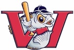
One problem you run into when you name a team after food is coming up with a logo that doesn't look like, you know, food. (I have no idea what a team called the California Rolls could do, for example). Fortunately it's a bit easier when the team is named after an animal you eat, so the Winnipeg Goldeyes logo simply features a fish. Is it specifically a goldeye? It's too stylized to tell, but let's give it the benefit of the doubt. The fish forms the bottom portion of a circle which is also a capital G, and also a baseball. The logo is a bit boring, but it avoids a lot of the pitfalls of minor league logos. Their old logo was more recognizably a goldeye, but it was also holding a baseball bat and wearing a ball cap.
 Needless to say, I prefer to new
logo. That's not really saying much, because being better than the
previous one is really a pretty low bar to clear. And the more I look
at it, the more I realize that it really looks more like a corporate
logo than a sports logo. It's a little too clean for a sports logo. If
you took away the baseball stitches and told me it was the logo for a
brand of smoked fish, I'd totally believe it. Because that's what this
looks like: a logo for food.
Needless to say, I prefer to new
logo. That's not really saying much, because being better than the
previous one is really a pretty low bar to clear. And the more I look
at it, the more I realize that it really looks more like a corporate
logo than a sports logo. It's a little too clean for a sports logo. If
you took away the baseball stitches and told me it was the logo for a
brand of smoked fish, I'd totally believe it. Because that's what this
looks like: a logo for food.
Which makes sense, I suppose, because in essence, that's exactly what it is.
Final Score: 116 points.
Penalties: Letter, 24 pts; Cartoon, 47 pts; Player, 51 pts.
Bonuses: Local, -6.