

HOME
HOCKEY
OTHER
RULES
RANKINGS
HISTORY
TEAMS
Teams with asterisks are not yet posted
Aberdeen IronBirds
Acereros del Norte
Águila de Veracruz
Aigles de Trois-Rivières
Akron RubberDucks
Albuquerque Isotopes
Algodoneros de Unión Laguna
Altoona Curve
Amarillo Sod Poodles
Arkansas Travelers
Asheville Tourists
Augusta GreenJackets
Beloit Sky Carp
Billings Mustangs
Biloxi Shuckers
Binghamton Rumble Ponies
Birmingham Barons
Boise Hawks
Bowling Green Hot Rods
Bradenton Marauders
Bravos de León
Brooklyn Cyclones
Buffalo Bisons
Caliente de Durango
Capitales de Quebec
Carolina Mudcats
Cedar Rapids Kernels
Charleston Dirty Birds
Charleston RiverDogs
Charlotte Knights
Charros de Jalisco
Chattanooga Lookouts
Chesapeake Baysox
Chicago Dogs
Clearwater Threshers
Cleburne Railroaders
Columbia Fireflies
Columbus Clippers
Columbus Clingstones
Conspiradores de Querétaro
Corpus Christi Hooks
Dayton Dragons
Daytona Tortugas
Delmarva Shorebirds
Diablos Rojos del México
Dorados de Chihuahua
Dunedin Blue Jays
Durham Bulls
El Paso Chihuahuas
Erie SeaWolves
Eugene Emeralds
Evansville Otters
Everett AquaSox
Fargo-Moorhead RedHawks
Fayetteville Woodpeckers
Florence Y'Alls
Fort Myers Mighty Mussels
Fort Wayne TinCaps
Fredericksburg Nationals
Fresno Grizzlies
Frisco RoughRiders
Gary SouthShore RailCats
Gastonia Ghost Peppers
Gateway Grizzlies
Glacier Range Riders
Grand Junction Jackalopes
Great Falls Voyagers
Great Lakes Loons
Greensboro Grasshoppers
Greenville Drive
Guerreros de Oaxaca
Gwinnett Stripers
Hagerstown Flying Boxcars
Harrisburg Senators
Hartford Yard Goats
Hickory Crawdads
High Point Rockers
Hillsboro Hops
Hub City Spartanburgers
Hudson Valley Renegades
Idaho Falls Chukars
Indianapolis Indians
Inland Empire 66ers of San
Bernardino
Iowa Cubs
Jacksonville Jumbo Shrimp
Jersey Shore BlueClaws
Joliet Slammers
Jupiter Hammerheads
Kane County Cougars
Kannapolis Cannon Ballers
Kansas City Monarchs
Knoxville Smokies
Lake County Captains
Lake Country DockHounds
Lake Elsinore Storm
Lake Erie Crushers
Lakeland Flying Tigers
Lancaster Stormers
Lansing Lugnuts
Las Vegas Aviators
Lehigh Valley IronPigs
Leones de Yucatán
Lexington Legends
Lincoln Saltdogs
Long Island Ducks
Louisville Bats
Lynchburg Hillcats
Memphis Redbirds
Midland RockHounds
Milwaukee Milkmen
Mississippi Braves
Missoula Paddleheads
Modesto Nuts
Montgomery Biscuits
Myrtle Beach Pelicans
Nashville Sounds
New England Knockouts
New Hampshire Fisher Cats
New Jersey Jackals
New York Boulders
Norfolk Tides
Northern Colorado Owlz
Northwest Arkansas Naturals
Oakland Ballers
Ogden Raptors
Oklahoma City Comets
Olmecas de Tabasco
Omaha Storm Chasers
Ottawa Titans
Palm Beach Cardinals
Pensacola Blue Wahoos
Peoria Chiefs
Pericos de Puebla
Piratas de Campeche
Portland Sea Dogs
Quad City River Bandits
Rancho Cucamonga Quakes
Reading Fightin Phils
Reno Aces
Richmond Flying Squirrels
Rieleros de Aguascalientes
Rochester Red Wings
Rocket City Trash Pandas
Rocky Mountain Vibes
Rome Emperors
Round Rock Express
Sacramento River Cats
Salem Red Sox
Salt Lake Bees
San Antonio Missions
San Jose Giants
Saraperos de Saltillo
Schaumburg Boomers
Scranton/Wilkes-Barre RailRiders
Sioux City Explorers
Sioux Falls Canaries
Somerset Patriots
South Bend Cubs
Southern Maryland Blue Crabs
Spokane Indians
Springfield Cardinals
St. Lucie Mets
St. Paul Saints
Staten Island FerryHawks
Stockton Ports
Sugar Land Skeeters
Sultanes de Monterrey
Sussex County Miners
Syracuse Mets
Tacoma Rainiers
Tampa Tarpons
Tecolotes de los Dos Laredos
Tigres de Quintana Roo
Toledo Mud Hens
Toros de Tijuana
Tri-City Dust Devils
Tri-City ValleyCats
Vancouver Canadians
Visalia Rawhide
Washington Wild Things
West Michigan Whitecaps
Wichita Wind Surge
Wilmington Blue Rocks
Windy City Thunderbolts
Winnipeg Goldeyes
Winston-Salem Dash
Wisconsin Timber Rattlers
Worcester Red Sox
Yolo High Wheelers
York Revolution
| Leones de Yucatán | 30 |
Notice: All logos on this page are included within the parameters of 17 U.S.C. § 107, which states that the reproduction of a copyrighted work for purposes of criticism and/or comment is not an infringement of copyright. No challenge to the copyrights of these logos is intended by their inclusion here.
Posted 2014 June 13
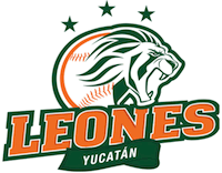
Sometimes two logos are so similar that it creeps me out. This is one of those times. A couple of weeks ago I wrote the review for los Broncos de Reynosa, where I noted that the horse was probably actually a demon in disguise for the following reasons:
- Rather than having hair that was a normal color, it had green hair.
- The eyes showed no pupil, but instead were solid white.
- The baseball was deformed instead of being properly spherical.
Anyway, the logo for los Leones is less disturbing than the logo for los Broncos, their similarities nonwithstanding. The horse in los Broncos' logo looks demonic. The lion here is simply a stylized lion. It's not nearly so disturbing. And the deformation of the baseball is less obvious. So I guess the best way to describe this logo is to say that it's a slightly less unnverving version of the logo for los Broncos de Reynosa.
Not that that's saying much.
* Baseball in Circle
** Just Another Crappy Kartoon Animal Logo
Final Score: 30 points.
Penalties: Region (egregious), 17 pts; Equipment, 13 pts.
Bonuses: None.